Showing posts with label popup. Show all posts

21 March 2013

things-a-week 10, 11, and 12

My thing-a-week posts have been backlogged, but that doesn't mean I haven't been making things.

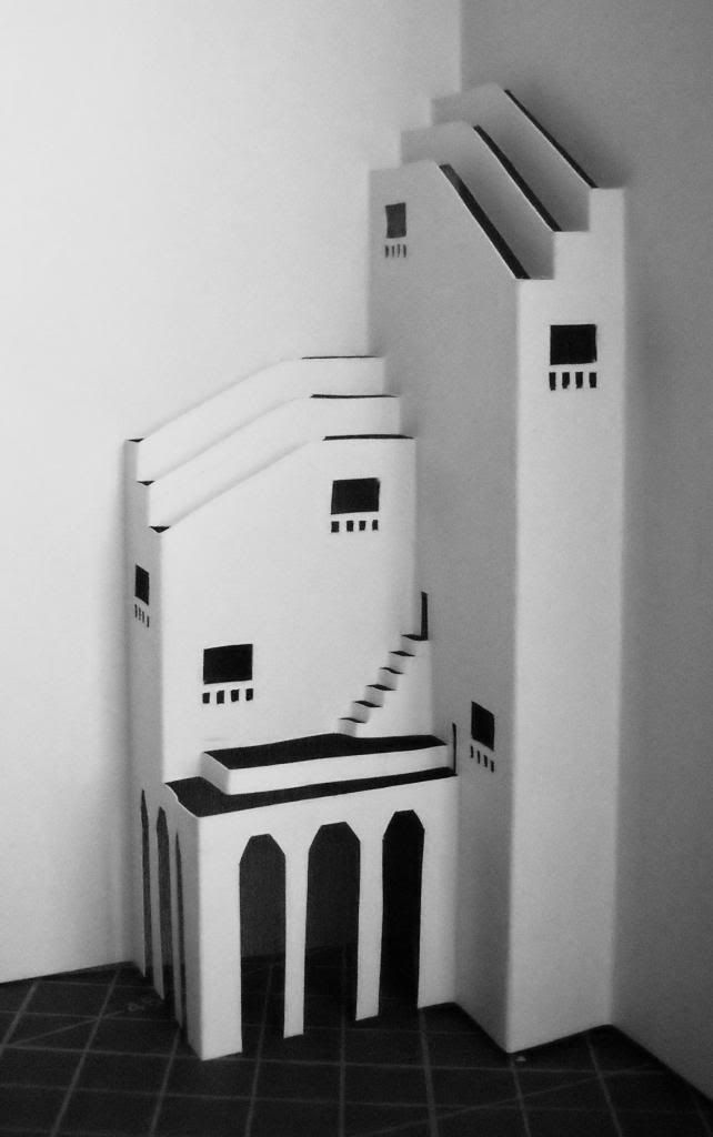
In January, I told Lance that some of my buildings come from the doodles I make to stay alert through sermons. For Week 10, I turned one of those doodles into a building, Elephant House:


This could be a building in a zoo, a hillside church, or a home somewhere rocky and dry, like Socotra with its funny trees, scrubby undergrowth, and pale rocks, or Joshua Tree National Park. The building might or might not actually be purple, but the windows would be made with blue and green colored glass.

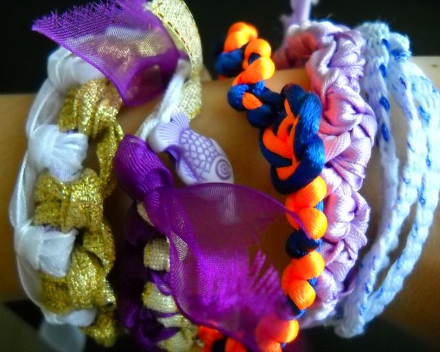
For Week 11, I learned to make bracelets with macrame, and I used pieces of ribbon I'd had lying around. They came from the packaging of PR stuff sent to the office, and I guess PR people have a thing for gold and purple. The fish bead is from a Gensan school supply store with a bin of assorted beads; they're all mixed together and go for P40 a cup. I also tried weaving a simple strap bracelet out of white string, some of it dyed blue.


The blue and orange bracelet is not entirely my own handiwork, by the way. Emily (Shi Yu), a volunteer teacher from China and one of Cris's colleagues, made the double coin knot in the center; I just did the macrame on the sides to see how it would look.

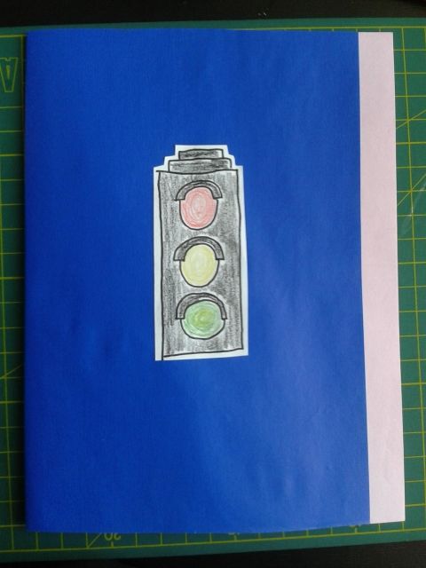
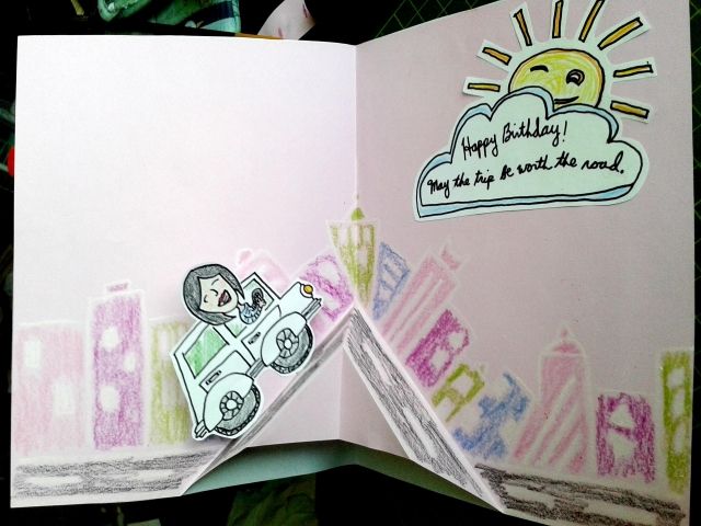
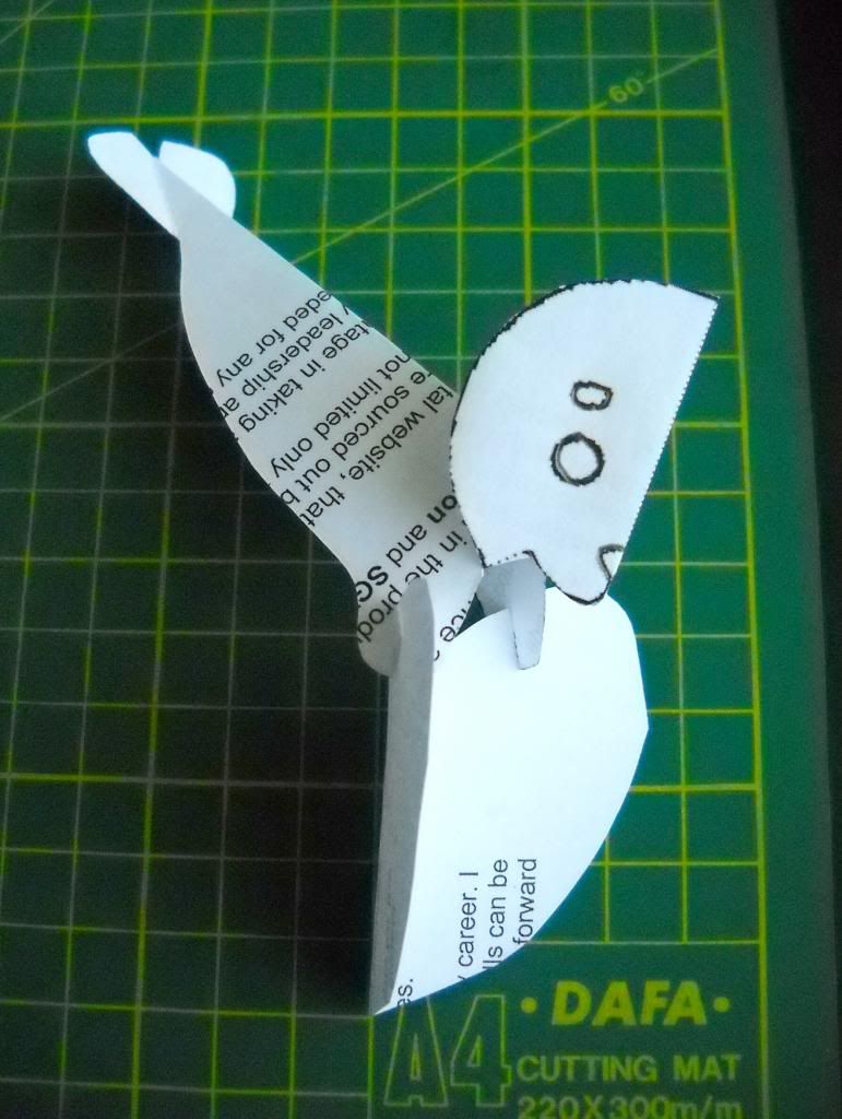
For Week 12, this week, I decided to go back to making birthday cards for people at the office. One of the writers, Gianna, is 23 now. This simple popup card is inspired by the time I witnessed her drive on EDSA for the first time ever, and in the middle of Friday night rush hour, too.


01 March 2013

thing-a-week 9: kirigami "Rajasthani Palace" / Letter No. 15

I've said before, I have a thing for ruins, and if you get me started on ruins, I will eventually quote Geoff Dyer:

Ruins don’t encourage you to dwell on what they were like in their heyday, before they were ruins. The Colosseum in Rome or the amphitheater at Leptis Magna have never been anything but ruins. They’re eternal ruins. It’s the same here. This building could never have looked more magnificent than it does now, surrounded by its own silence. Ruins don’t make you think of the past, they direct you toward the future. The effect is almost prophetic. This is what the future will end up like. This is what the future has always ended up looking like. (Source)

If I wanted some text tattooed onto me, it would be taken from this passage, but I'm afraid it's quite long. It's also hard to distill into a phrase without sounding cheesy, and anyway, I've had too many strange skin problems to brave a possible ink allergy now.

The point is that I really, really, really like ruins and the idea of ruins: Jorge Luis Borges's city of the Immortals, the vision of the future in Alan Wiseman's "The World Without Us", the abandoned cities in "The Martian Chronicles" by Ray Bradbury, the ghost town that is Jinhua Architecture Park, the strange Sarangani hotel inhabited by three dobermans and a shih tzu, the fantastic buildings in the paintings of Arturo Luz, and so on.


You might argue that Luz's paintings aren't of ruins; the lines of the buildings are too clean. But look at them: the sky is blank, the landscape is bleak, and there's no sign of a human apart from the buildings themselves. They might as well be ruins — but that makes them more, not less wonderful.

Ruins are two things to me: a reminder that the only thing constant is entropy, and a challenge to make something that entropy will take at least a few centuries to wear down.

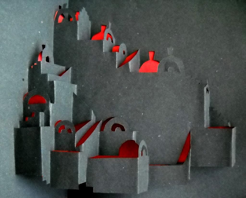
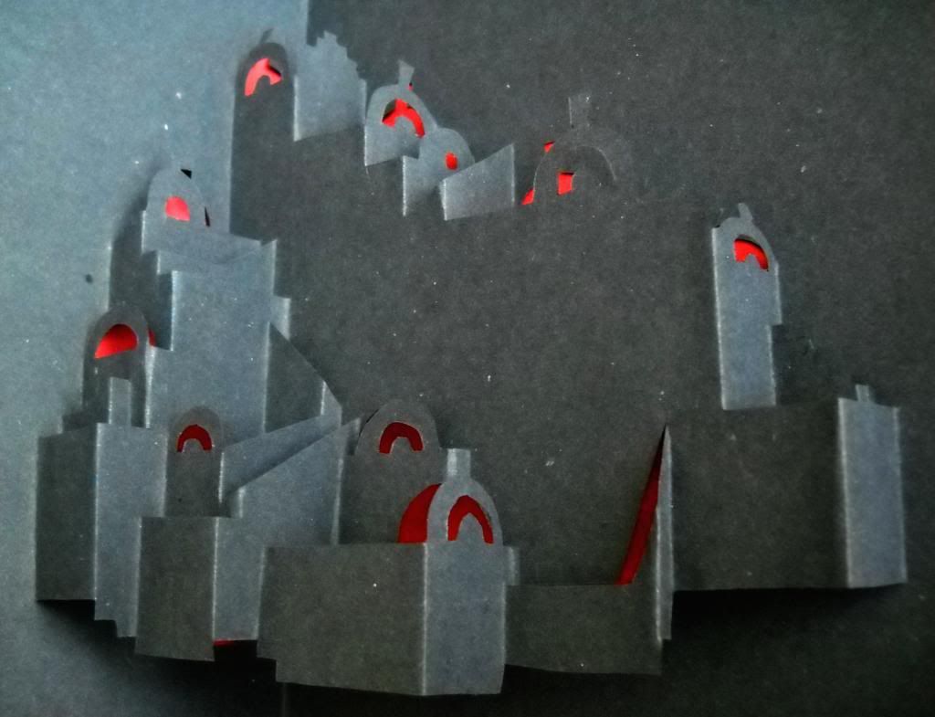
For this week's craft, I did a kirigami model of one of Luz's painting-buildings, "Rajasthani Palace." Ever since I saw his works on exhibit, I wanted to make models, and "Palace" felt like a good place to start.

Arturo Luz, Rajasthani Palace, 2008, 36 x 58 in., The Crucible Gallery


It's definitely less durable than stone columns, but I really enjoyed working on it. I liked the challenge of figuring out how much space the building and its sections might occupy. I liked imagining where each section began and what certain lines were for. The limitations of kirigami also meant that the building was more square than sprawling, and some parts couldn't join where they join in the painting. But that just added to the fun of the project.

If I had any frustrations, it's that the construction paper was too soft for the palace to stand for photographing; I had to hold it in my hand or set it on its side to take these pictures. And yes, I did use black paper, but my camera's weird exposure has made it kind of gray.

One more note about ruins: if you ask me where all my paper buildings are, I'll tell you that they've been crushed, thrown away, or simply slipped into a clearbook or envelope to be forgotten. Maybe it's weird, but there's something about them that makes them difficult for me to preserve: they don't come out the way they do in my head, the cuts or creases are imperfect, paper isn't very durable, I have photographs in case I ever want to do any building over again, and if even those are lost, then I'll have the fun of starting again.

It's not that I'm not attached to my buildings — I love them — it's that I know I can't really keep them forever.
14 February 2013

thing-a-week 7: seal of love

This week's craft was a Valentine card for Cris. That's why this post is scheduled for late in the evening, to avoid spoiling the surprise, and doesn't feature photos of the completed craft, to keep it a little more special.

Instead, I offer you pictures of the template:


as well as links to this and other templates:
I may have cheated a bit by using a template this week, but if it matters, the final card's design is a little more elaborate than the samples you see above and in the links.

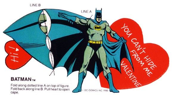
Here, have a Batman valentine, too, courtesy of my friend Vikki.


Happy Valentine's Day, everyone!

08 February 2013

things-a-week 5 and 6: washer necklace, future library

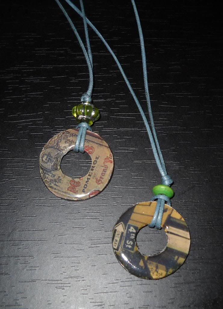
I was out a lot last week, so I didn't have a lot of time for crafts at home. I was able to throw together another washer necklace, though:


The one with the wine bottle label is something I made late last year, while experimenting with DIY gift ideas for some friends. The one with the street signs is the one I made for last week's thing-a-week.

I'm not too happy with it; I actually salvaged a botched washer piece to make it, but that made trimming the edges of the paper difficult. That's why it looks a little rougher than the wine label piece.

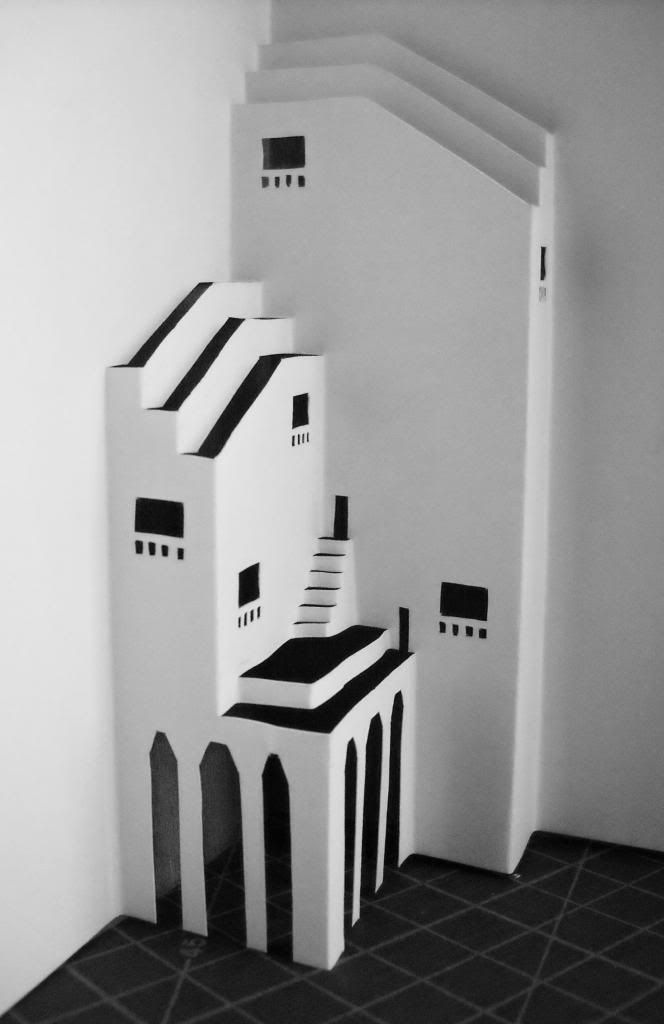
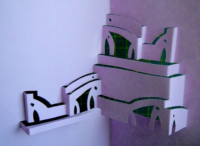
For this week, I made another popup building. This one came out of a doodle, but I started to imagine a library. I kept imagining monks with winged hats coming out of these doors while water or fog flowed under the arches and spaceships flew overhead. Kinda retro, kinda not.


23 November 2011

Cut, cut, cut

Some of you might have guessed from this post (not that I was terrifically discreet) that something big was coming for me in the arts and crafts department. Well, yesterday, everything finally came together.


What happened was, the creative director of our newspaper's luxury magazine saw one of my popup buildings and asked me if I could make some for the Christmas issue, which would feature some really, really, really pricey fountain pens. In a moment of hubris, I said yes.

After the meeting with the photographer, I spent most of my spare time drawing buildings and cutting models. I also sat through three howtoarchitect playlists (1, 2, and 3) in one day for tips and ideas.

I also spent a day with Highlife's production assistant, Nina, going to stores and picking out pens to feature. It is a little ridiculous to walk into one of those stores, ask for the most expensive thing they have, and be taken seriously.

There are more photos from the shoot here, and I'll be posting the actual shots in a week or so. It depends on whether I can sit on them till the magazine actually comes out.

I am trying to play it cool at the office, but inside, I am kind of panicky about the whole thing. None of the work is as great as I'd like it to be. On the other hand, it was nice to be asked to spend a day on something that I really, really love to do.

Baby steps, I guess.


In this picture, you can see the backs of Kathy Chua, photographer, and her assistant Eric. They are cool people, and Adphoto is a cool agency.

09 November 2011

O, Papierbaum! (peek)


Here's a little preview of a project I'll be working on this month.

I went to a meeting with a photographer and some magazine people this afternoon and felt sicker and more panicky every minute. The potential for screwing up feels horribly high.

Let's hope I don't crack—blades are involved, after all.

02 July 2011

Long Week

I was wrong to say that I wouldn't have a week like the draining one I had at the end of May. Most of June has been one "last week of the month" after another, and here we are at the start of July, making good on our jokes that we would be typing poolside and giving everyone murderous looks during the company outing.

Well, more like sitting up in the hotel bed, so that I can see the sea just beyond our balcony. I did get an hour or two's swimming yesterday in that much-vaunted infinity pool, at least. And I think we still had fun--more fun than if the current subjects of our ire had been along on the trip, at least.

I think I will be right this time, though, to say that these draining days will end soon, or at least take a new shape for me. We hired someone to take over much of the grunt work, but there's also other stuff happening within a month or so that will change things.

I guess I can't say a lot until there's been some kind of official announcement. It just feels like there have been too many of them to process within the past two months, and a little strange that I'm taking things better than I thought I would (or I just think so; not a bad thing to think, though).

What else? Thursday, I sent off this birthday card I made for the greatest person I ever interviewed. Call me inspired, awed, honored, starstruck--take your pick, I guess. With all the neat stuff he's bound to have received, though, I don't expect him to see, much less like my little token (especially considering how sloppy some of the cuts were), but I was happy just to see it leave my hands and enter a courier's. I hope the man had a great day.

07 June 2011

Whiteout-popup Quality of Life Report

Two months ago, I saw this post by Adam David (possibly NSFW) calling for blackout poem / "visual erasure" contributions. I thought it might be a good exercise for my popup buildings, as well as to maybe work out my love-hate relationship with the city while telling a story.

I missed the "Erase Erase" deadline, though, so I decided to just post the work here. Click on each thumbnail to enlarge (they're arranged in order from left to right, like a regular book; filenames are numbered if you're confused).


Just some notes, which you don't have to read.

It was harder than I thought, to pick something that was inexpensive even for Booksale (P45), had the right title, at first glance held the kinds of words I was seeking, and, most importantly, wouldn't feel like a huge loss once I started cutting out pages. Meghan Daum's "The Quality of Life Report" fit the bill more than anything else I saw (I ended up buying more than one book that day) because the blurb on the back made it sound like the kind of sweetly cheesy, "I'm Reed Fish"-type of story that I'd probably catch on Star Movies during off seasons.

This is probably blasphemy to any book-lover, but I didn't even read the book before cutting into it. The deadline was pretty close, and I haven't had a lot of time to read; the last thing I read, I finished last week but bought in late February. I did end up reading the cut pages, though, and I felt bad afterward. It did sound like an interesting and well-written story after all. So, if you ever read this, Ms. Daum, please accept my sincerest apologies, as well as a promise to buy your book if I ever see another copy in a local store. Your other book sounds interesting as well.

How I made it: I chose the words first, sliced out those pages, and sketched the buildings and skylines I wanted to put over/under them. The buildings themselves didn't take more than two or three hours to plot and cut for each spread, if you don't count the spreads discarded for wrong measurements or cuts. I used black crayon on the parts of the book page that would show up behind the buildings, then glued the pages onto the back while trying to get the words to line up with the windows before the glue* dried.

In the end, though, work and other things took up my time, and I finished the last spread just on Sunday. The photos and layout (if you can call it that) were done this morning after I woke up. I desaturated everything on my computer because my camera's white balance was acting funny.

The whole project was fun but also tiring in that I kept coming up against my own lack of imagination for these buildings. Now that I'm aware of it, though, I'll keep trying to come up with more interesting things in the future.

--
*Boring notes about glue: Elmer's white glue comes in the easiest bottle to work with, but God help you if your paper's not perfectly aligned when you stick it on; this stuff dries fast. Elmer's "school" blue glue gives you time to push the paper into place before it dries, but if you use too much, some parts of the paper will look permanently wet and dark. Locally made Sti-Kee (?) glue works the same way without the wet look, but the bottle is a pain to work with because some idiot thought a glue "spreader" next to the nozzle was a good idea, when really, it just gets in the way of everything. The glue's also so thick that it comes out of the bottle in globs instead of a neat line.