While working on my photos from the Easter weekend, I found myself pushing the saturation sliders farther than l usually do. Yes, it's a simple trick; similar effects are so used in apps like instagram that it can be cooler to scoff at them than to even think of using them. But when you like something, you like something.
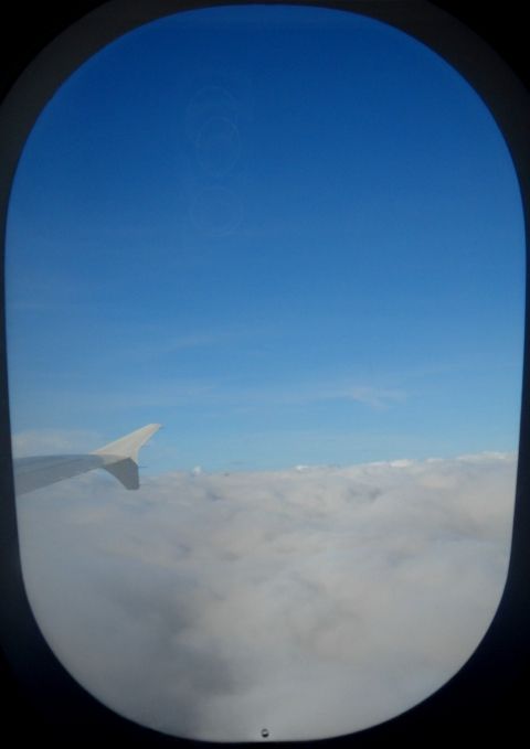
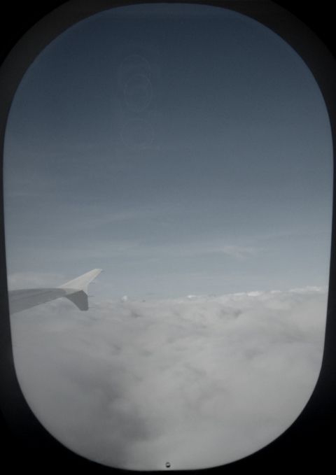
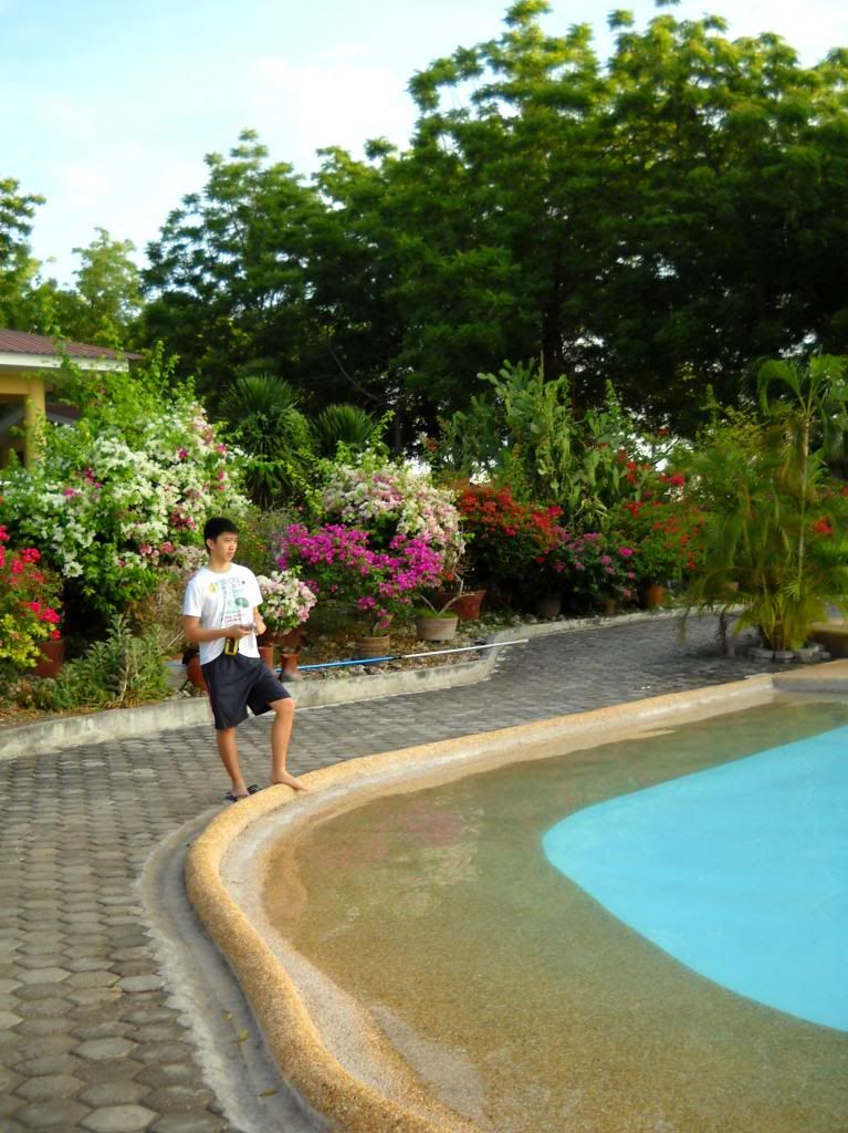
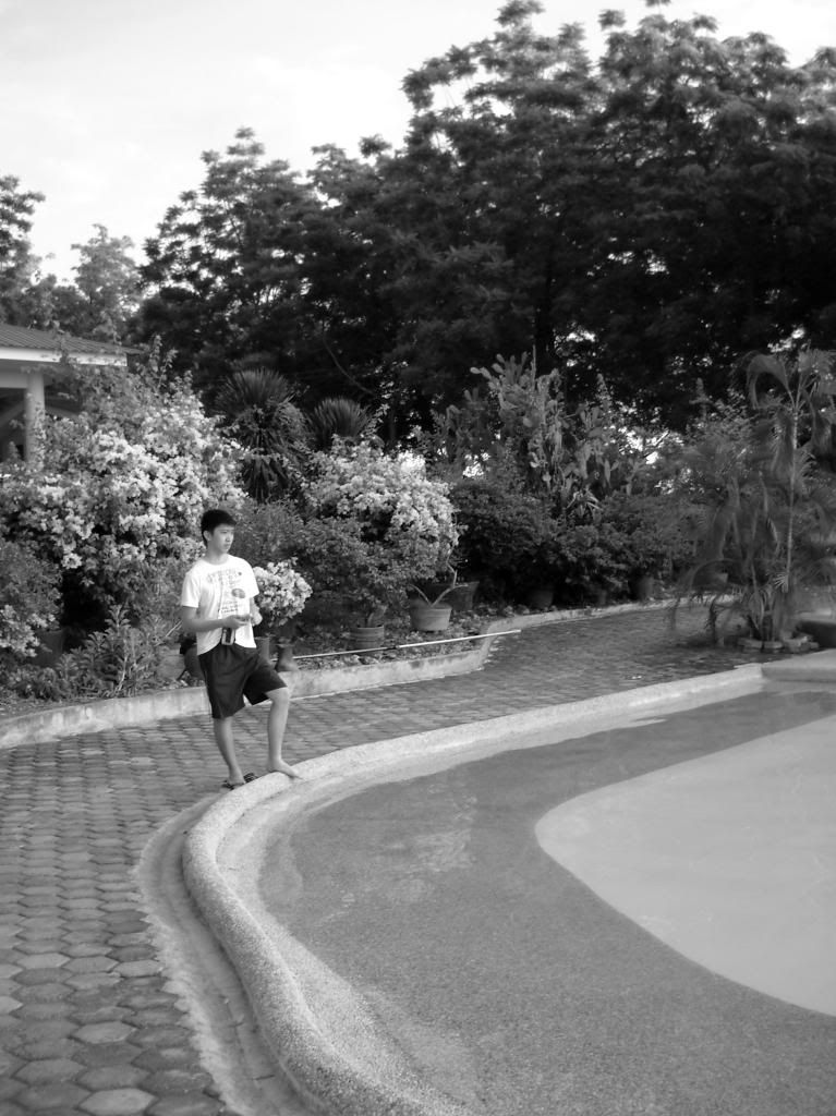
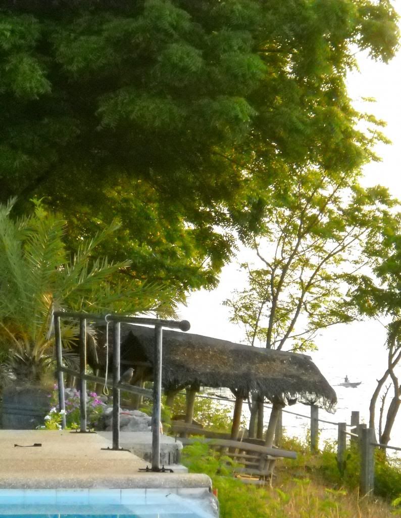
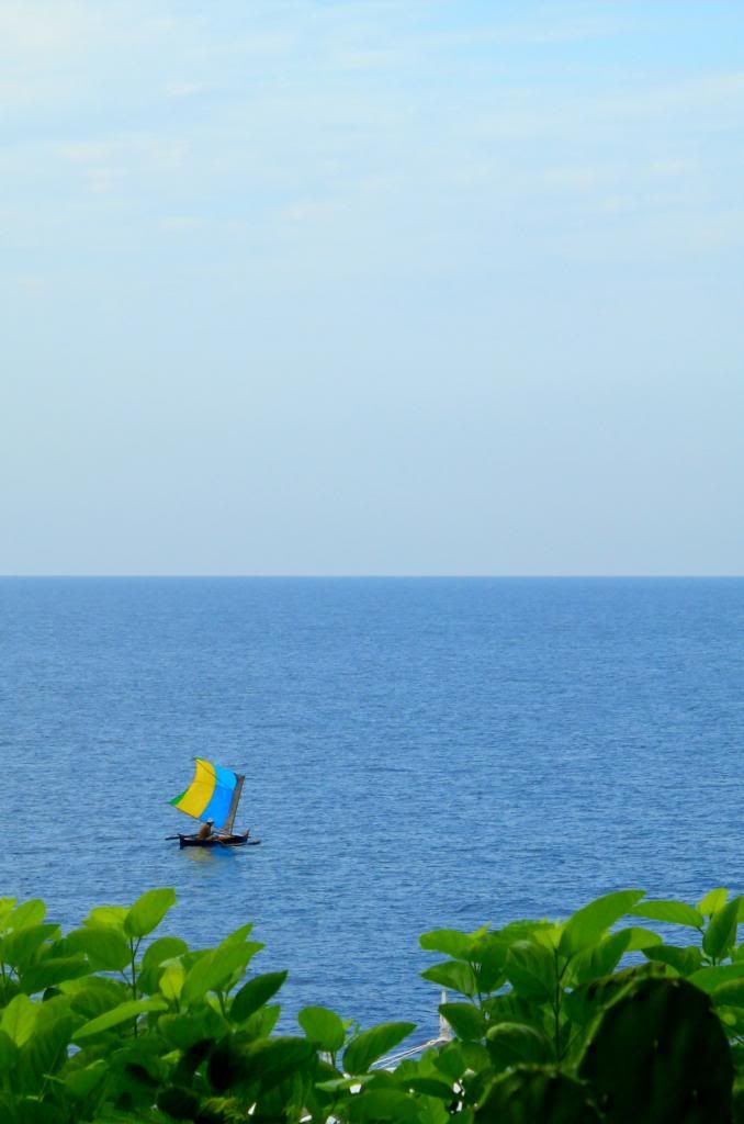
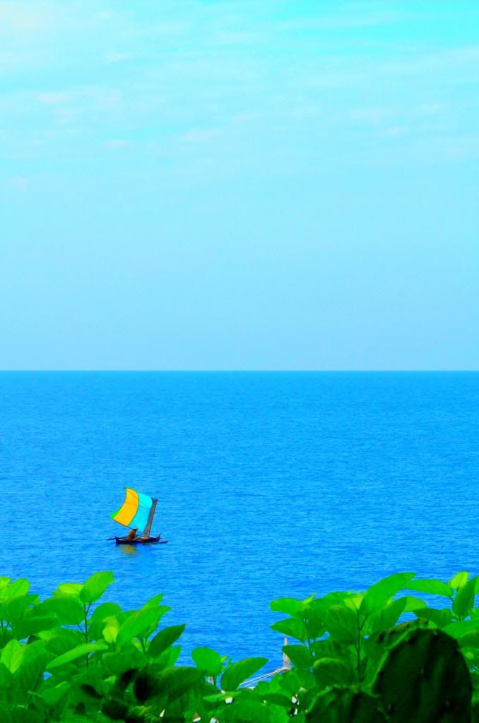
So I like how a little desaturation can make descending through the clouds look a little lonelier, & a lot can make a swimming pool disappear, or a tree seem it's on the moon.
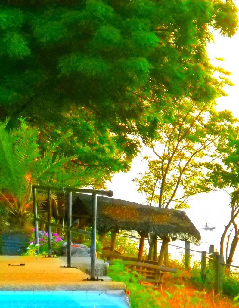
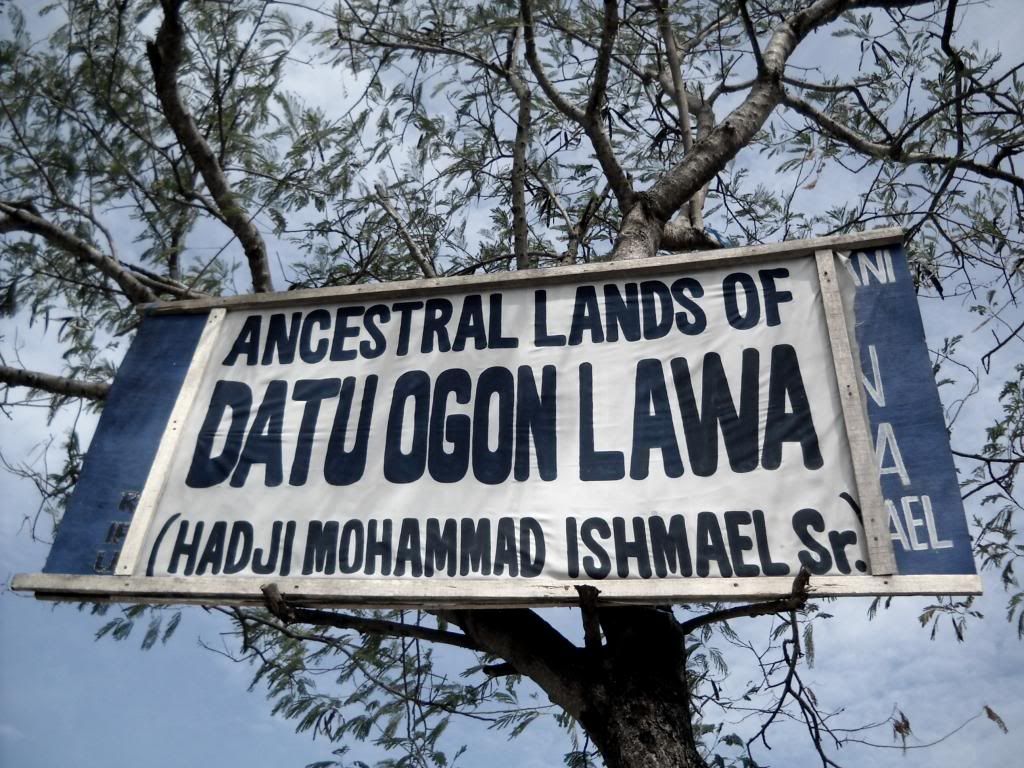
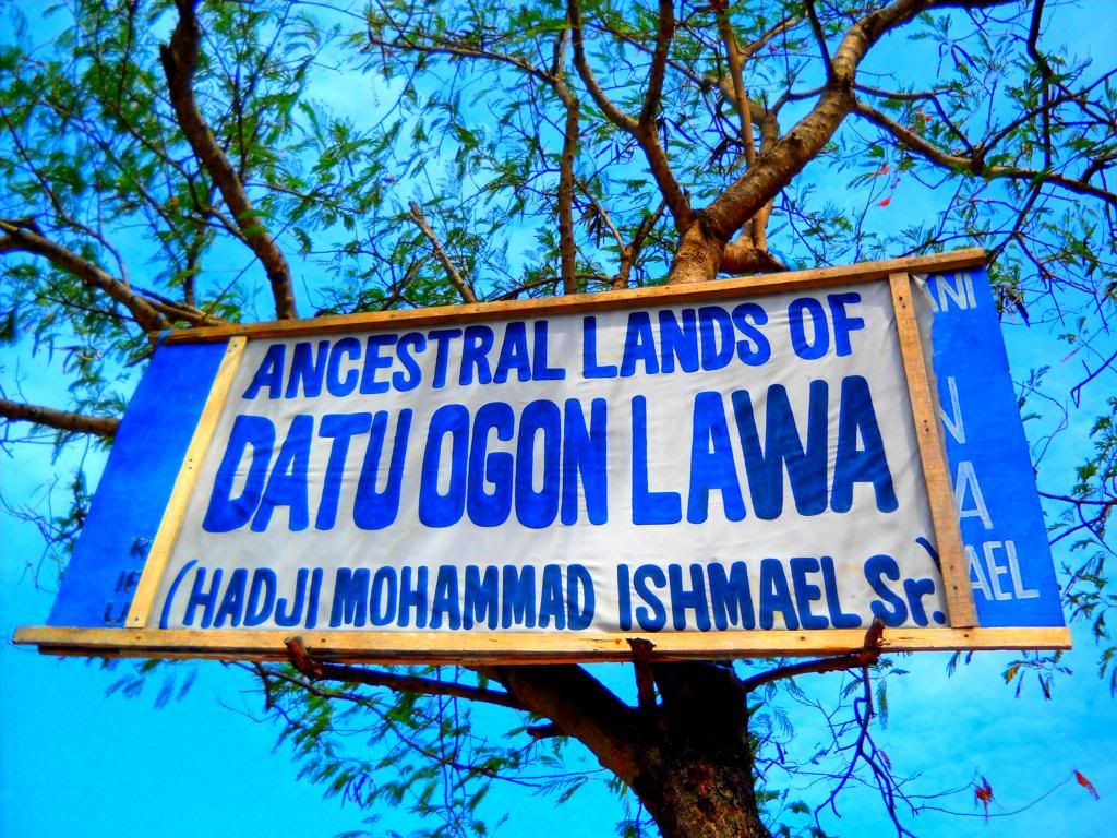
Oversaturation, on the other hand, can set quiet grass on fire.
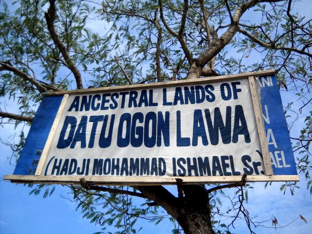
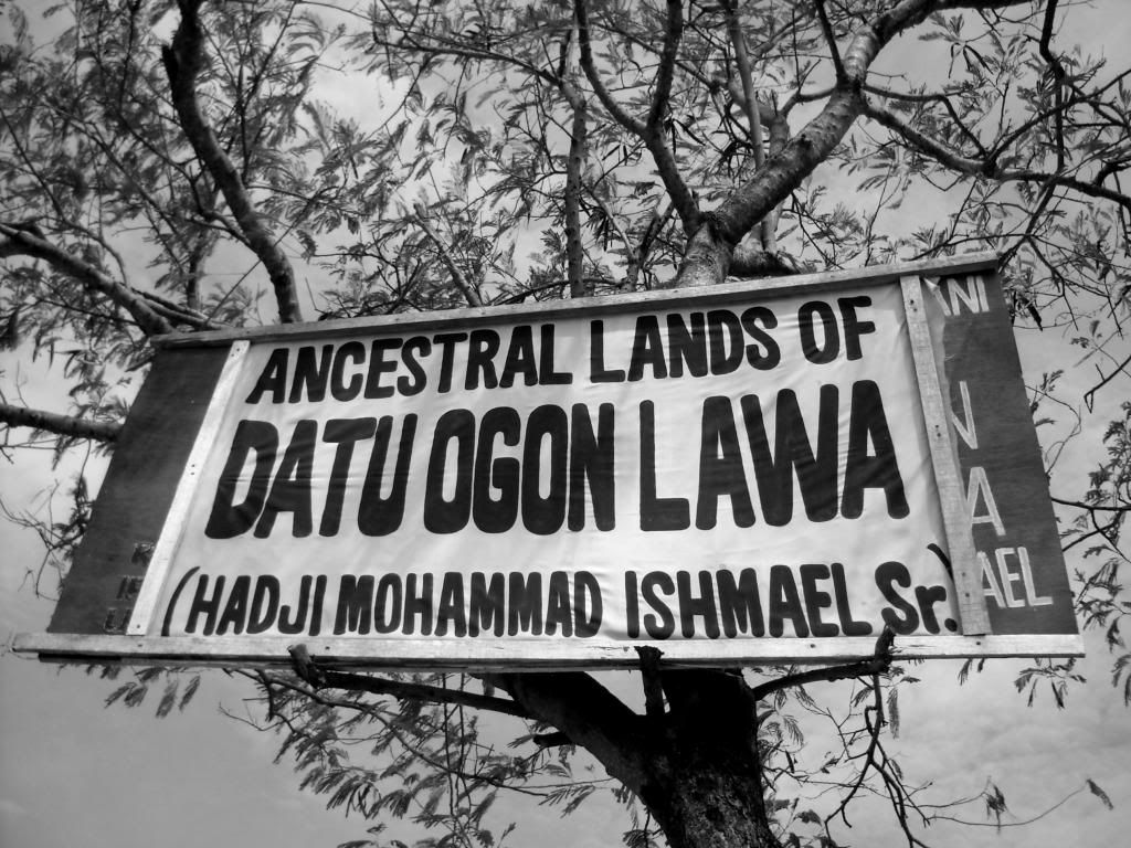
And of course, there's the vintage effect, where desaturation makes a photo look older and overSaturation recalls the travel posters of the early 20th century.
Technology is a big help, of course; it gives me the benefits of techniques that older photographers had to learn with film cameras and darkrooms. But while software, whether smartphone app or desktop program, has been this big equalizer, it's also given me better appreciation for both amateur and professional photographers who choose unique subjects and angles.
Online photo essay feeds such as the excellent TIME Lightbox also gift me with access to photographers and photos I might never have seen otherwise. And when these lensmen and women are quoted about their work, I understand it a little better and, in turn, start to ask myself what I'm looking for within the frame of my own humble point-and-shoot.
Returning to saturation, I've also come to appreciate black-and-white better. Silence replaces fussing over correct hues when they are gone altogether, leaving only the subject as it was and how you decided to look at, frame, and remember it that day. By removing color, you see light, movement, & texture better and thus experience the image — interact with the subject — more intimately.
Perhaps because black-and-white is associated with age, it brings temporality to the fore of a photo. The lack of color makes me see the way my father's skin rests on his cheekbones; what that means can't be far behind.
In black-and-white, landscapes are starker but also more alien, more removed from you in time as well as space. Without color or caption, this Sebastião Salgado photo might as well be of something on Mars, and there's no real telling when it might have been taken.
It's an obvious conclusion, and others have arrived at it before: photos are images of past people and places; postcards to yourself from a previous point in time. The moment after you take a photo of a hillside, the hillside is already different; blades of grass, the branches, and the farmer have all moved on, into the future. How much more different will it be if you get to go back a year, five years, decades from now?
I don't always get to go back. In my case, desaturating, de-coloring my photos heightens the sadness I feel over leaving; it drives in deeper the idea that the images and their contents are forever behind me. I will never see the sea, the sky, these trees, or my brothers this way again.
It's a mood thing. My usual pre-upload process actually includes increasing the saturation of my photos, making them brighter and more alive, filling in the gap between fog and inaccurate white balance on one side and memory and reality on the other. I miss my family.
No comments:
Post a Comment